This blog showcases the creative process of students enrolled in Archmere Academy's AP Studio Art program throughout the 2020-21 school year.
Thursday, October 29, 2020
Ferreira - Completed Scratchboard Project
"The Watchers"
This scratchboard project was a challenge for me in several ways, primarily it took a long time to add enough detail in the brick to get it the brightness I wanted. I liked how the original image was but I made it more abstract through purposefully skewing some of the windows/buildings and adding figures. I wish I had taken this approach from the start, I would've been done much faster I think.
Wednesday, October 28, 2020
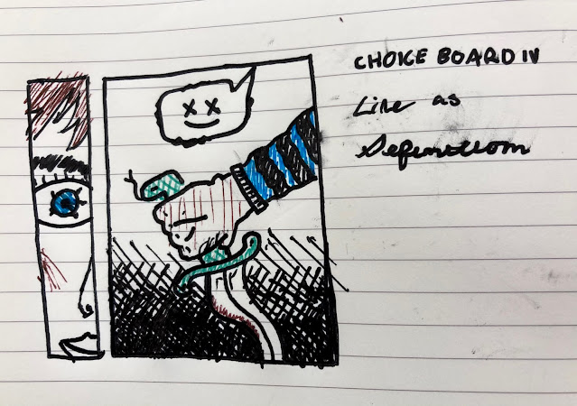
Ferreira - Choice Boards 3 and 4
The artist I chose for my 3rd choice board was Laurent Lemoigne, a french designer and digital artist. He creates these crazy, trippy, surreal portraits of people and animals fused with technology. You have to see it to understand, here's some examples.
I was originally going to go for "striped" for CB4 but I found myself leaning more towards definition. Having stark, contrasting lines sort of brings emphasis to the crudeness and nature of the content. Again, a little dark but I like it. This one actually took me the longest because I could not figure out how to draw the hand.
Jill Bale - Hybrid Project
I took both a thumbnail sketch and a print I made in my printmaking class. I really like how the white of the face stands out with the neon background.
Tuesday, October 27, 2020
Ferreira - Completed AP Alphabet!
I'm really proud of how this turned out! I know I expected to do a hybrid digital-physical piece but doing it all digitally showed me my strength is definitely in 2d digital design as opposed to physical mediums. Of course I still like to do physical art but I wouldn't have been as proud as I am of this if I had done it because I find I have more freedom to tweak and change things to my exact liking than if I was doing, say, watercolor or pastel for my letters. This project also showed me my favorite kinds of style to produce. I liked the challenge of the fine detail and texture (I-T), but I feel I had more fun in the more trippy and dark alley (V-?), which I hope to pursue further in my central focus projects this year.
janae's digital hybrid-final project
Bale - choice board 4 - design principle:line
I was looking at Sol LeWitt's work and saw his black and white usage of lines and I thought it looked really cool. I also decided to add in the 3 purple lined to make something stick out!
Monday, October 26, 2020
Bella Dayrit Choice Board #4 Line as Punctuation
For this choice board, I wanted to try using line as punctuation. I did something a little different from the example but I did a guache wash of color and then drew a figure using pencil and soft pastel on top to outline it. The different colored lines that make up the figure are supposed to act as the punctuation sticking out from the rest of the background colors. I left the face white because I wanted it to stick out.
Subscribe to:
Comments (Atom)


